Services
Menu
Community
Menu

© Bisplex 2022


Karbon | Conversion Rate Optimization
Karbon
Karbon is a revolutionizing workflow management system. The platform is specifically designed for accounting firms and boasts extremely handy features to maximize productivity and transparency. This world-leading software facilitates communication between employees, managers, clients, and partners and provides seamless automation options to save valuable time.
Karbon is a well-established provider of operational platforms. Their software empowers hundreds of different firms around the world. But with the emergence of the COVID-19 pandemic, their services gained much more significance. Companies looking to shift towards remote work would’ve greatly benefited from utilizing Karbon.
Not long into the pandemic, Karbon began launching extensive digital ad campaigns to expand its customer base. The company expected a massive uplift in sales since their intensified marketing efforts concurred with the huge rise in demands for workflow automation software.
It seemed like the stars were aligned for Karbon to hugely increase its market share. They had a brilliant product at hand. Their marketing strategy was well-thought-out and promising. They had leveraged different advertising methods and were waiting for customers to pour in. But surprisingly, the increase in sales was significantly lower than forecasts.
Bisplex was brought on board to discover the issue. The client required a comprehensive audit of Karbon’s marketing funnel and advertising strategy. The sheer scale of Karbon’s multi-layered strategy was what made this project challenging. Finding the weak link in this long chain was like finding a needle in a haystack. We had to carefully review every part of it to figure out what was setting Karbon back from reaching its marketing goals and remove it.
We started our work by granularizing Karbon’s pandemic-era strategy. Dividing the marketing funnel into smaller parts would’ve helped us figure out the weak points faster. Our experts reviewed each of the following parts simultaneously:
In our in-depth qualitative research, we realized that the later stages of Karbon’s marketing funnel had become a bottleneck. The client’s ad campaigns were very successful in building brand awareness and grabbing the attention of prospects. The main issue was conversion. Karbon had no problem driving prospects down their marketing funnel, but failed to convert them into customers or generate leads. To be more specific, the landing page had a lot of issues that stopped the client from seizing its plentiful opportunities.
The aforementioned landing page was custom-designed and packed with information about the product. It was apparent that this page was out of place. Once we identified it as the main issue, we looked deeper into it to figure out its exact weaknesses. This would’ve assisted us in finding the optimal way to enhance it and remove any user frictions.
We found the following issues on the landing page:
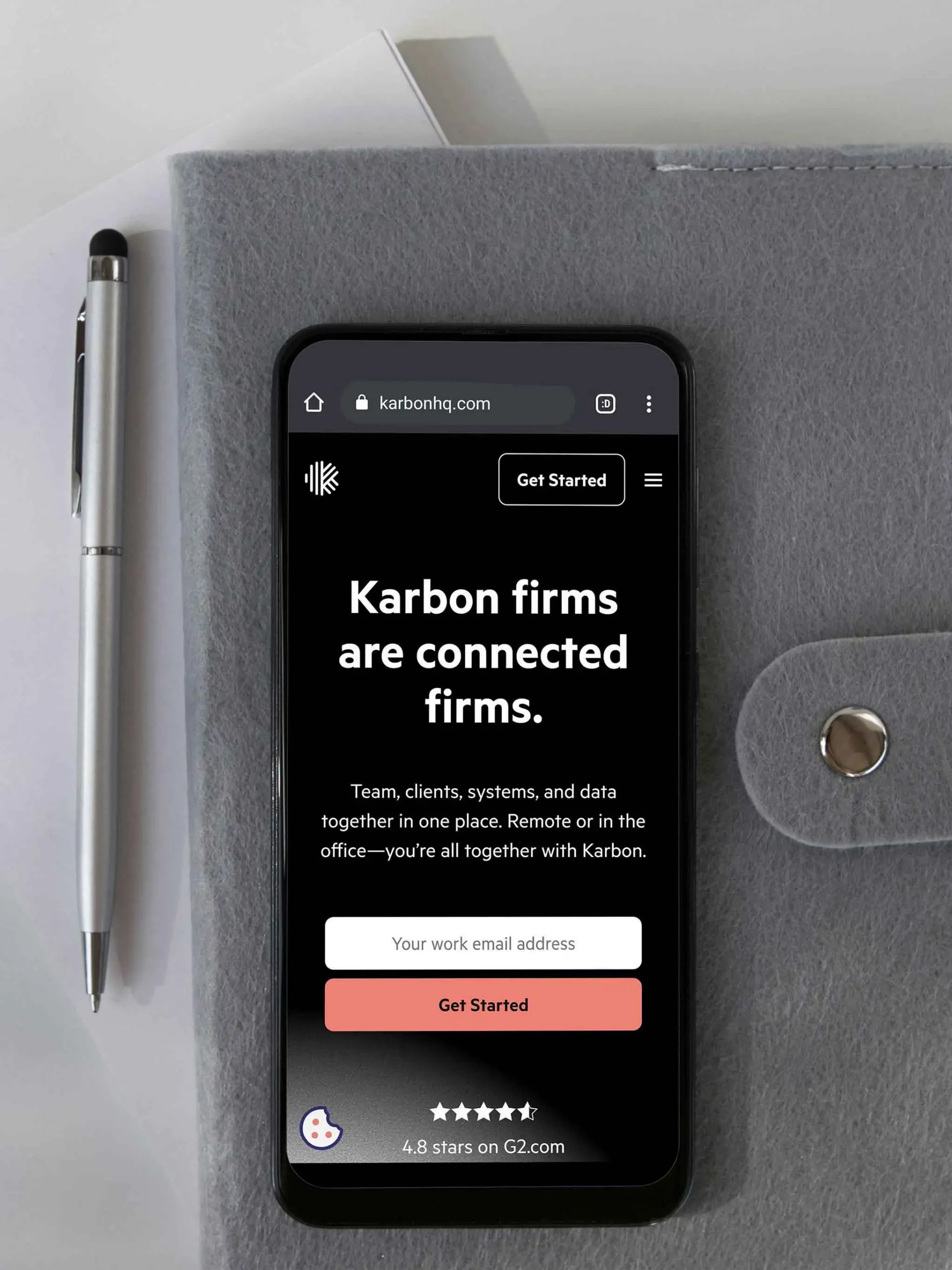
The website had an impressive look and experience but the landing page wasn’t consistent with it. This problem alienated the visitors and had a negative impact on the perception of the product’s quality. Instead of focusing on the easy-to-understand advantages of the product and the opportunities they bring, the copy was cramped with extensive technical jargon. Another major problem was the poor mobile experience. The unresponsive UI didn’t resize properly on different screen sizes, making the experience unpleasant.
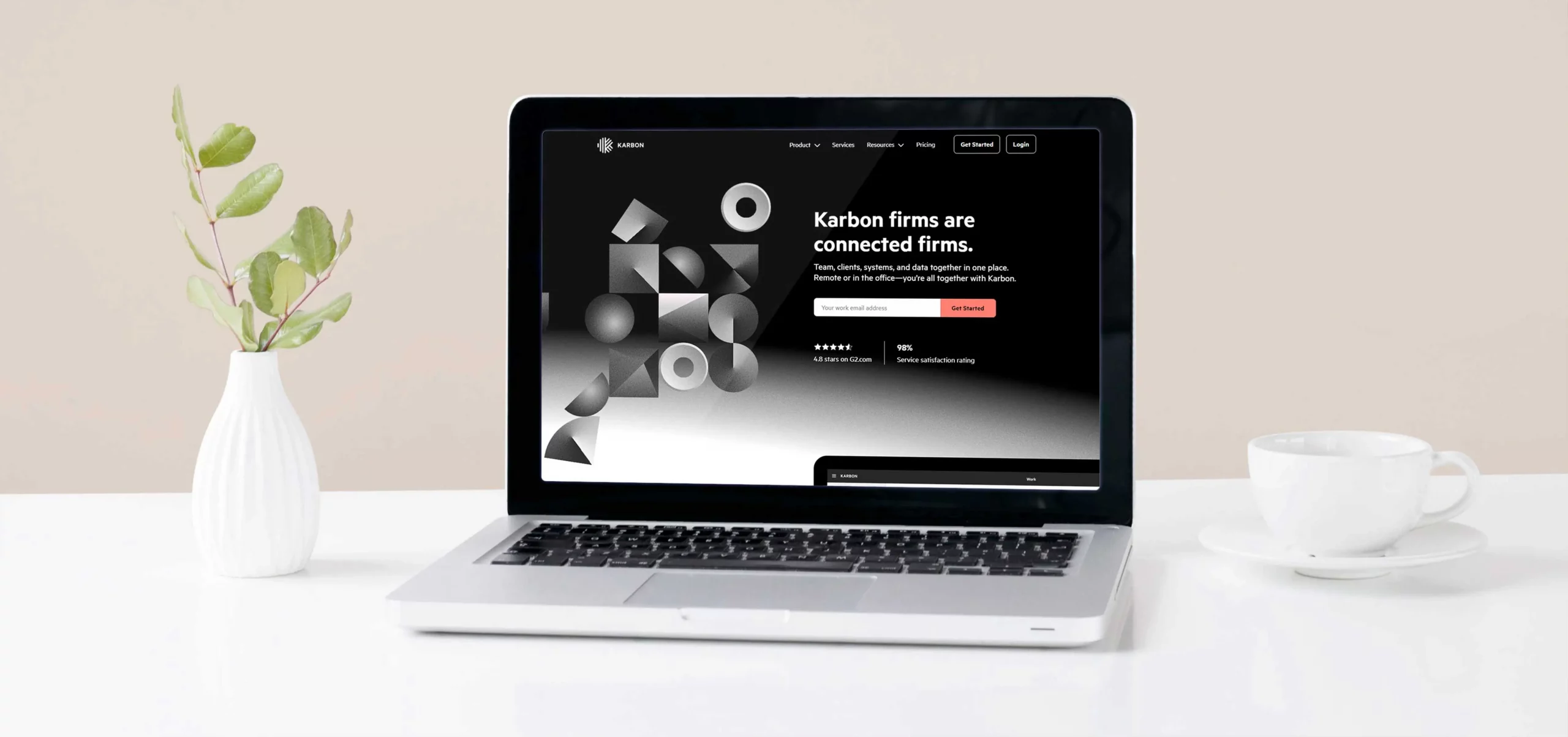
Since the problems with the landing page fell into diverse categories, we assigned multiple teams to this project. Our design team worked closely with Karbon’s internal design team to enhance the overall aesthetic of the landing page and make it less cramped and more consistent with the interior pages. We made sure the page had a smooth user experience throughout all devices, loaded quickly, and was focused on leading visitors toward the desired action, which was signing up for a demo.
After consulting with the client, our copywriting team decided to fully scrap the previous copy and write a completely new one that fits the new design. The new copy that we wrote grabbed the user’s attention better, provided a sufficient amount of technical info, and was highly focused on enhancing the comprehension of the value proposition.
The new landing page was tested for multiple weeks with 50% traffic allocation and the results were fantastic. Our design outperformed the existing version in tests by 29% more conversion. As the result of our conversion rate optimization efforts on Karbon’s underperforming landing page, we managed to strengthen the later stages of the client’s marketing funnel and increase the overall visitor-to-lead conversion rate by a whopping 37%.

© Bisplex 2022
| Cookie | Duration | Description |
|---|---|---|
| cookielawinfo-checkbox-analytics | 11 months | This cookie is set by GDPR Cookie Consent plugin. The cookie is used to store the user consent for the cookies in the category "Analytics". |
| cookielawinfo-checkbox-functional | 11 months | The cookie is set by GDPR cookie consent to record the user consent for the cookies in the category "Functional". |
| cookielawinfo-checkbox-necessary | 11 months | This cookie is set by GDPR Cookie Consent plugin. The cookies is used to store the user consent for the cookies in the category "Necessary". |
| cookielawinfo-checkbox-others | 11 months | This cookie is set by GDPR Cookie Consent plugin. The cookie is used to store the user consent for the cookies in the category "Other. |
| cookielawinfo-checkbox-performance | 11 months | This cookie is set by GDPR Cookie Consent plugin. The cookie is used to store the user consent for the cookies in the category "Performance". |
| viewed_cookie_policy | 11 months | The cookie is set by the GDPR Cookie Consent plugin and is used to store whether or not user has consented to the use of cookies. It does not store any personal data. |
