Enhancing The Website
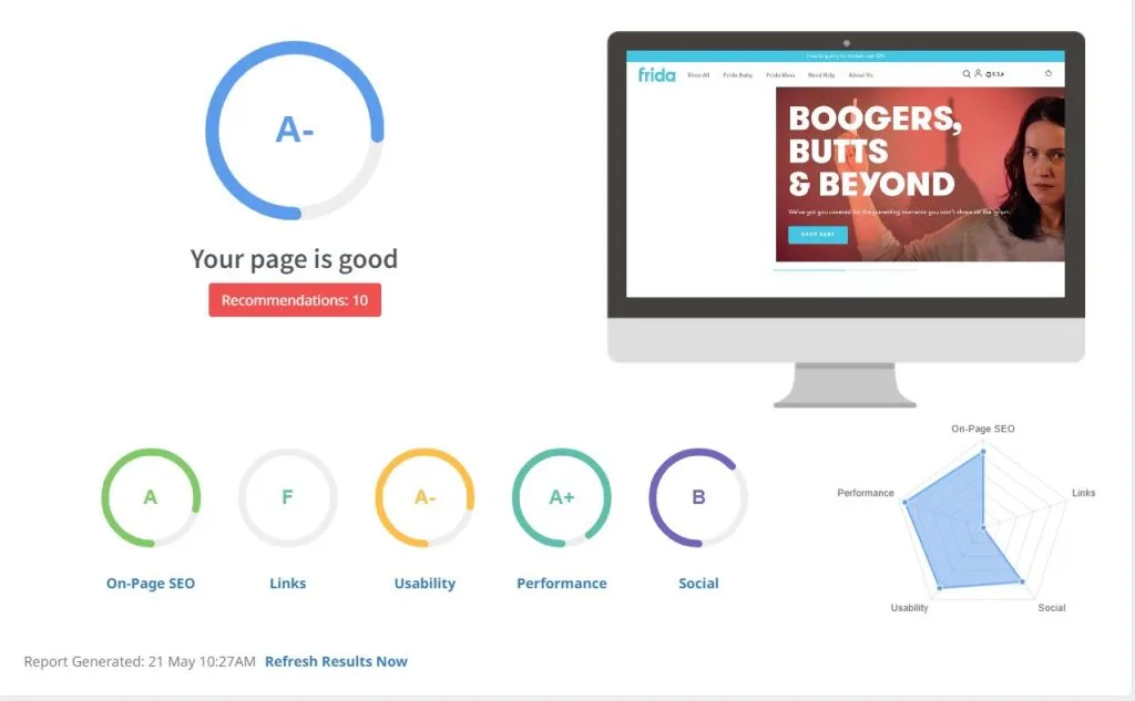
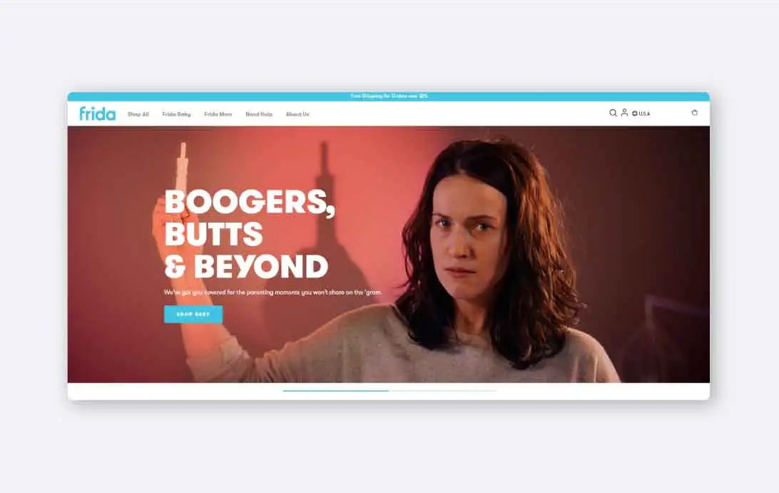
We first had to carry out every necessary improvement and modification on Frida’s website to make sure it’s completely optimized for search engines. This included tweaks to the user interface design and reshaping the overall flow of the website. Frida’s products fall into two main categories: Frida Baby and Frida Mom. It was crucial to make it easy for visitors to find what they were looking for to minimize bounce rate and drive more conversion.
Improving The User Experience
Previously, the client’s online storefront lacked proper categorization of products. Many users struggled to find the product that would solve their problems or discover new products that could assist them in parenthood. To remedy this, we tweaked the navigation menu and optimized categorization to make it more understandable.

